

Store Layout Design: 11 Tips for Arranging Your Retail Shop

| Planning the layout of your store is both an art and a science — it requires creativity, psychological insights, and testing. Look at Store Layout Design.
In this article, we’ll explore common tactics that you can implement when planning the arrangement of your store. Go through them below and see if you can apply any of these pointers to your store’s layout and merchandising. 1. Use the right floor planYour floor plan plays a critical role in managing store flow and traffic. The choice of which one is right for you will depend on a number of factors including the size of your store, the products that you sell, and more importantly, your target market. What are your customers like? Are they shopping in a hurry or can they take their time? Do they prefer self-service features or will your associates guide them throughout the store? Do want to find exactly what they need efficiently, or are they open to discovering items along the way? These are just some of the questions you have to ask when deciding on your floor plan. While there are plenty of store arrangements that you can adopt, here are the most common ones in retail: Straight floor planThis floor plan involves positioning shelves or racks in straight lines to create an organized flow of traffic. It’s one of the most economical store layouts and is mostly used in large retail spaces, supermarkets, and in stores that primarily use shelving to showcase their merchandise. Racetrack or loop planThis layout encourages customers to “loop” your store. You position your fixtures and merchandise in such a way that you create a path to guide that guides shoppers around your shop. Angular floor planThis store layout consists of curves and angles to give off a sophisticated vibe. According to the Houston Chronicle, the angular floor plan is usually adopted by high-end retailers and it “reduces the amount of display area you have but focuses instead on fewer, more popular lines.” Geometric floor planThe geometric floor plan utilizes racks and fixtures to create a unique store feel and design. Go with this layout if you’re showcasing trendy products. Free flow planA free-flow layout affords you the most creativity. You’re not limited to floor patterns or shelves that have to be placed at certain angles. And unlike the other layouts, you’re not prodding people to use a path around your store; instead, shoppers are encouraged to browse and go in any direction. 2. Be aware of where you “lead” shoppersThere’s quite a bit of debate about whether or not retailers should lead customers in a clockwise or counter-clockwise fashion inside their stores. On one hand, some claim that since most people are right-handed, they instinctively turn to the right and explore the store in a counter-clockwise direction. However, other studies indicate that shopper direction has more to do with their vehicle traffic patterns. Consumers in the UK and Australia for instance, drive on the left side of the road so they have a tendency to explore stores in a clockwise manner while consumers from right-hand driving countries like the US usually turn right when they enter a shop. So which shopping direction theory should you believe? It looks like there is stronger evidence supporting the theory about driving behavior. As Herb Sorensen, author of Inside the Mind of the Shopper noted: The pattern of movement in the supermarket is counterclockwise in the United States, but PathTracker studies in the UK, Australia, and Japan show a much greater tendency for shoppers to move in a clockwise pattern there… traffic patterns in the store may also be affected by vehicle traffic patterns outside. In these small studies, we noted that in countries with right-hand driving, where traffic circles move in a clockwise pattern, shoppers in stores may be more comfortable moving in the same direction. Our recommendation? Test out the theory for yourself. If you find that your customers do indeed follow the country’s vehicle patterns, then you’ll know where to place new arrivals and other inviting elements. 3. Ensure that your product quantities are appropriateThe question of how much merchandise to have on display is an important one — and the answer is not clear-cut. On the one hand, having more products on the sales floor has proven to increase sales. When Dollar General increased its shelf height to 78 inches, sales per square foot increased from $165 to $201. Meanwhile, when Walmart reduced its inventory, sales steadily declined, so the company remodeled its stores to add stock back. What’s interesting, though, is while Walmart’s sales declined during that time period, customer satisfaction increased. In other words, customers were happier, but they weren’t buying as much. William S. Simon, then Walmart’s chief executive for the US division said that customers “loved the experience” of having less stock on the sales floor, but at the same time they also bought less. Having too many products on sale can lead to a decline in brand perception, especially if you’re trying to position yourself as a boutique or high-end retailer. As Paco Underhill, author of Why We Buy told the New York Times, “the more a store is packed, the more people think of it as value — just as when you walk into a store and there are fewer things on the floor, you tend to think they’re expensive.” The bottom line? The amount of stock to display in your store will depend on the size of your shop, the image you want to project, and the type of experience you want to create. If you’re a discount retailer who wants to make the most out of your store space, then packing your shop with merchandise could be a good strategy for you. But if you’re a high-end boutique, then it’s best to keep your selection curated and just put a few select items up for display. 4. Have enough space between products and fixturesIt’s ok to have shelves that are packed with merchandise (if that’s what you’re going for) as long as you still give your customers their personal space. You want to avoid the butt-brush effect, which according to Underhill, is a phenomenon where shoppers would abandon a display or product they were looking at when they were bumped once or twice from behind. Underhill wrote: While reviewing the tape to study how shoppers negotiated the doorway during busy times, we began to notice something weird about the tie rack. Shoppers would approach it, stop and shop until they were bumped once or twice by people heading into or out of the store. After a few such jostles, most of the shoppers would move out of the way, abandoning their search for neckwear. We watched this over and over until it seemed clear that shoppers — women especially, though it was also true of men to a lesser extent — don’t like being brushed or touched from behind. They’ll even move away from the merchandise they’re interested in to avoid it. 5. Use your layout to drive impulse salesYour store layout can be a powerful tool to increase sales. With the right merchandising, you could put key items in the radars of your customers and drive impulse purchases. Supermarkets are really good at doing this. Most grocery stores utilize their checkout to showcase popular impulse to buy products, such as gift cards, candies, and other items.
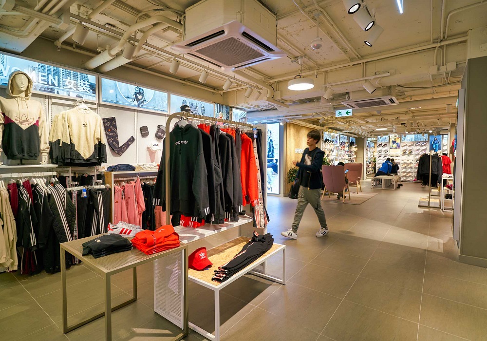
Another way to promote impulse purchases is to cross-merchandise your shelves with products that complement each other. Many apparel retailers implement this by displaying clothing items together with matching accessories.
|
{randomimage}wp-content/uploads/banners,100%,auto,Random image,https://iconicerp.com/apply-for-trial/{/randomimage}


